My Role: Design Lead
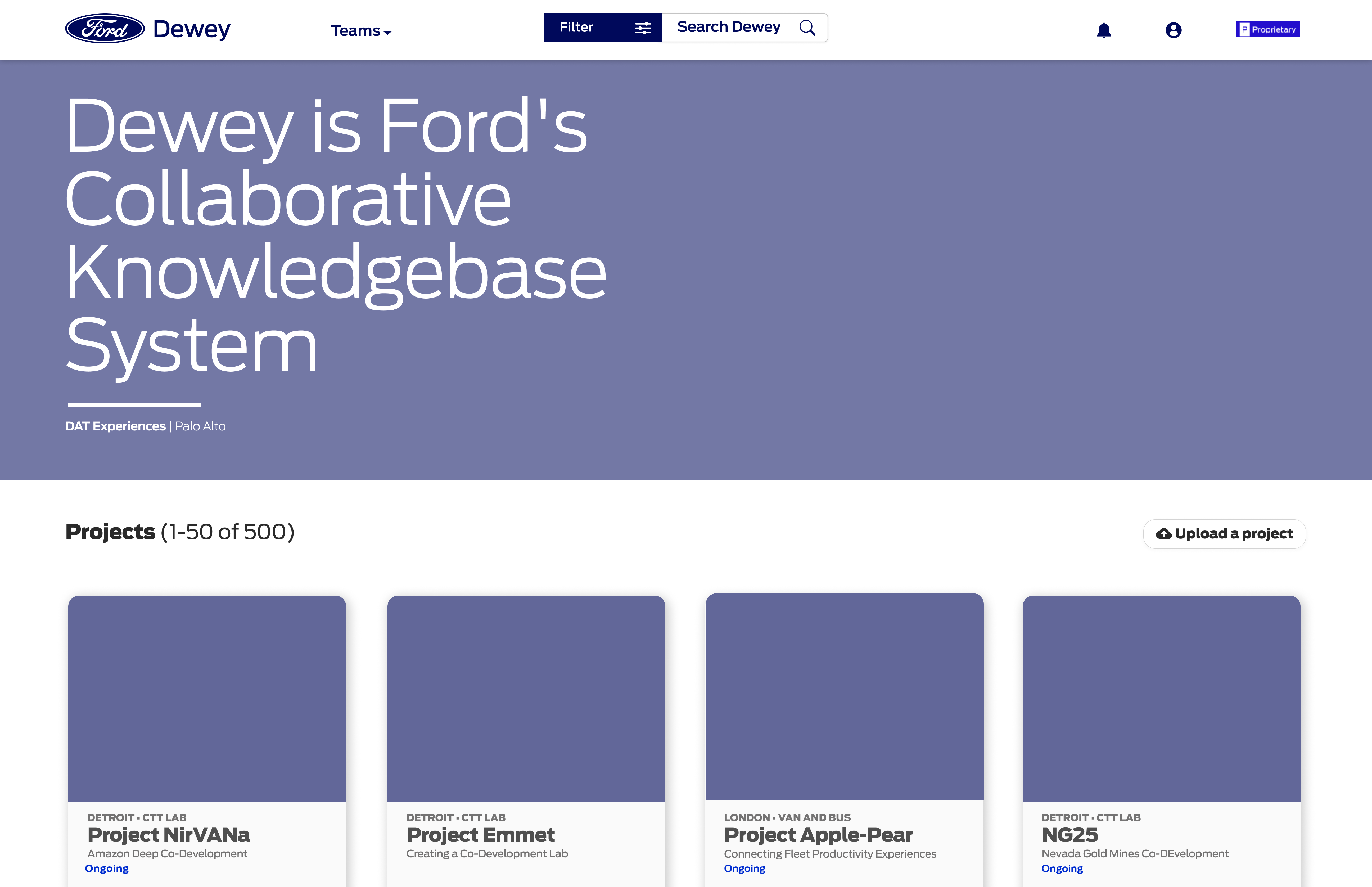
As Lead Designer of Dewey at Ford Motors, I redesigned and created features for an enterprise tool that serves teams and people across the company as their knowledge base system and collaboration platform. Over the almost two years of crafting the product, I led many research and testing initiatives to continue improving it. I led the engineers and met with stakeholders every week to make sure our product continued to thrive. During my tenure with Dewey we more than doubled unique users and retention rate soared. We onboarded many teams across the company, from Finance, Product Design, Research, Marketing and IT.
I was attracted to Dewey as a collaboration and research tool because I saw its potential as a space where the most influential people, products, ideas and projects could be seen and shared. As our product continued to grow and gain interest we realized that a lot of confidential and secret information contained in projects needed special attention in how users accessed, stored and shared the work. It was one of the greatest challenges leading the team into new territories of sharing yet protecting knowledge.
Tools: Figma, Miro, Jira, Adobe Photoshop and Illustrator
Duration: 1 year & 9 months
Scope: Redesign an enterprise tool towards adoption and retention by Designers, Researchers, Marketing, Executives, Business Leaders, and other teams at Ford worldwide.
Led the design and user testing of new features such as: Search and Filter, Notifications, Version History, Editor Tools, Archiving, Team and Bio Content Customization and Confidential and Secret Content Customization.
Led the team sprints and delivery goals, tracked user analytics and led all handoffs to development.
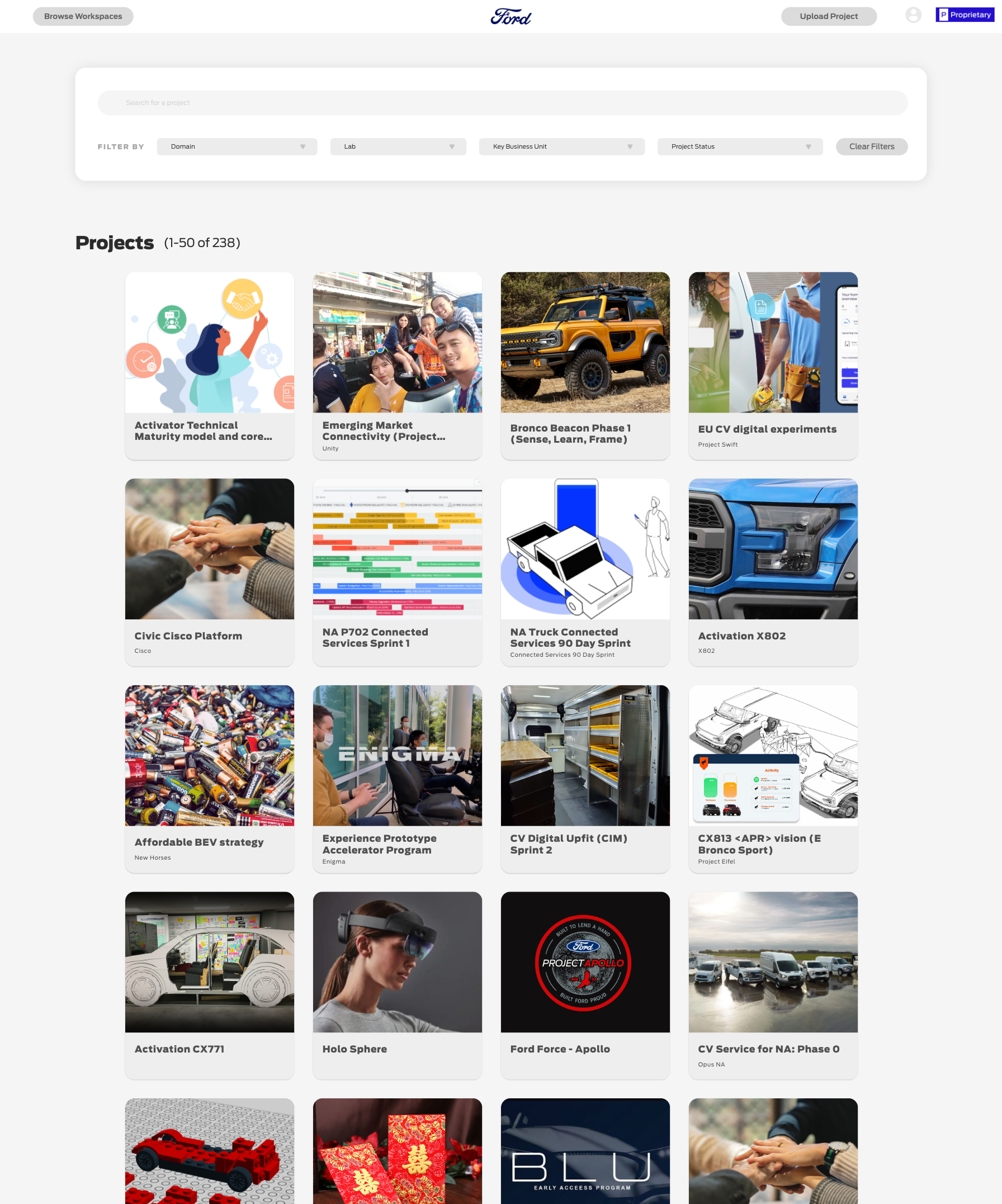
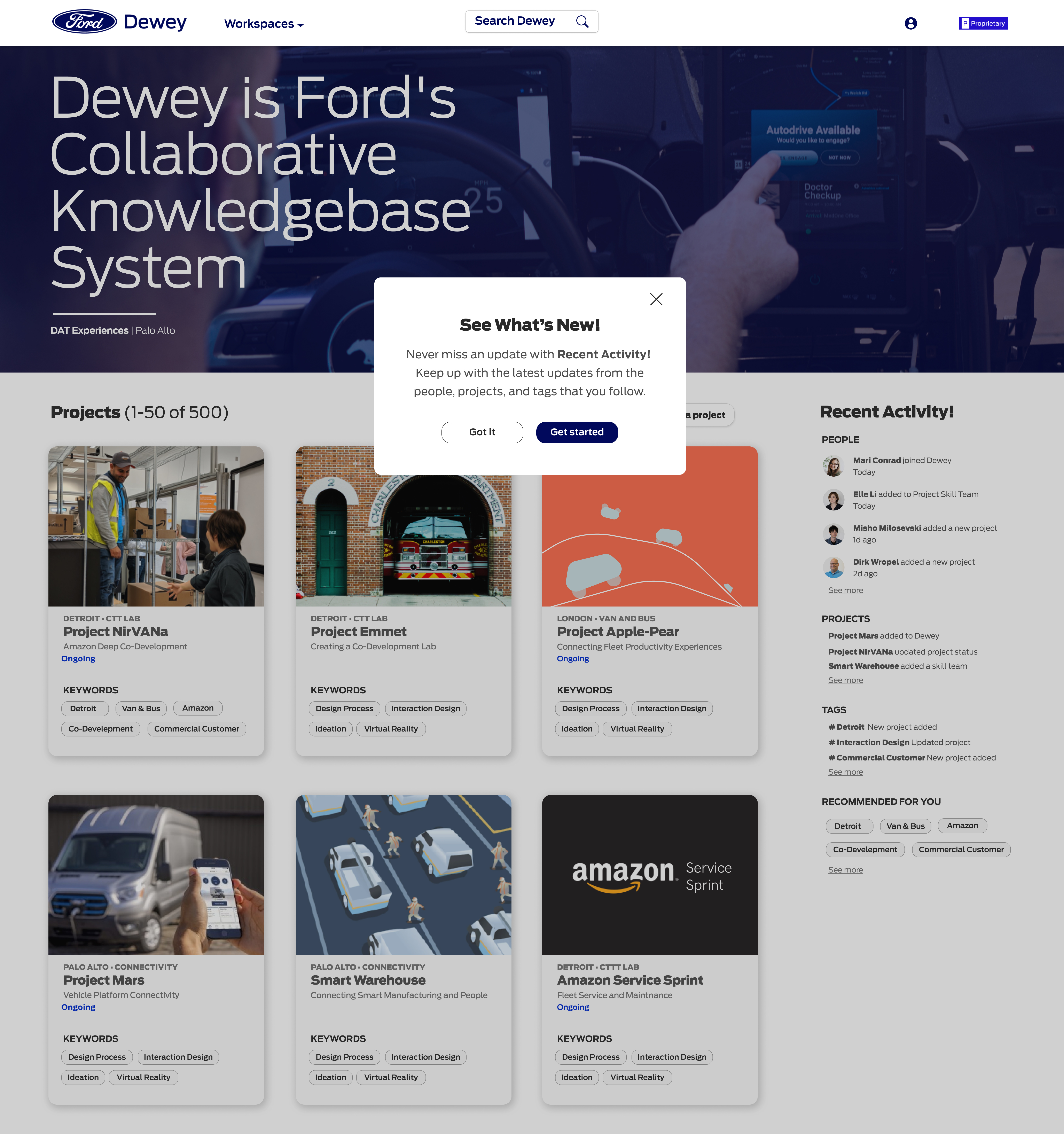
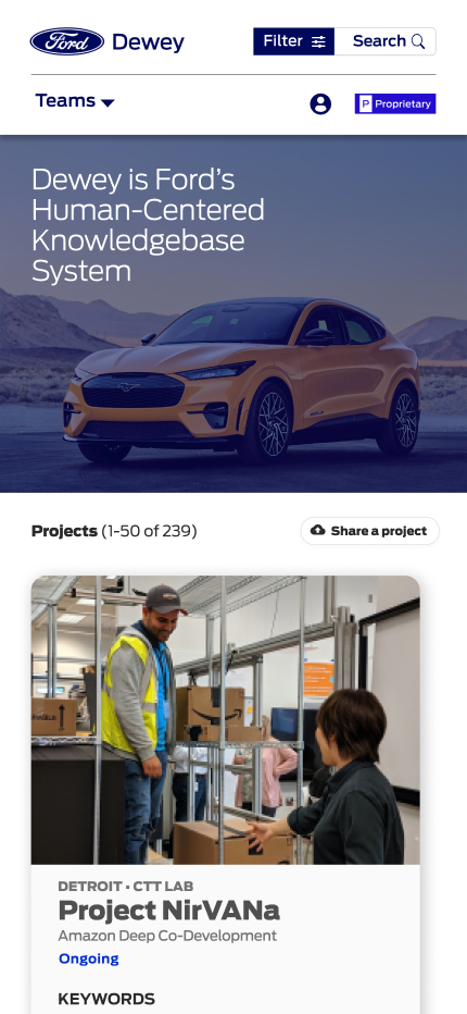
Dewey Before Re-design
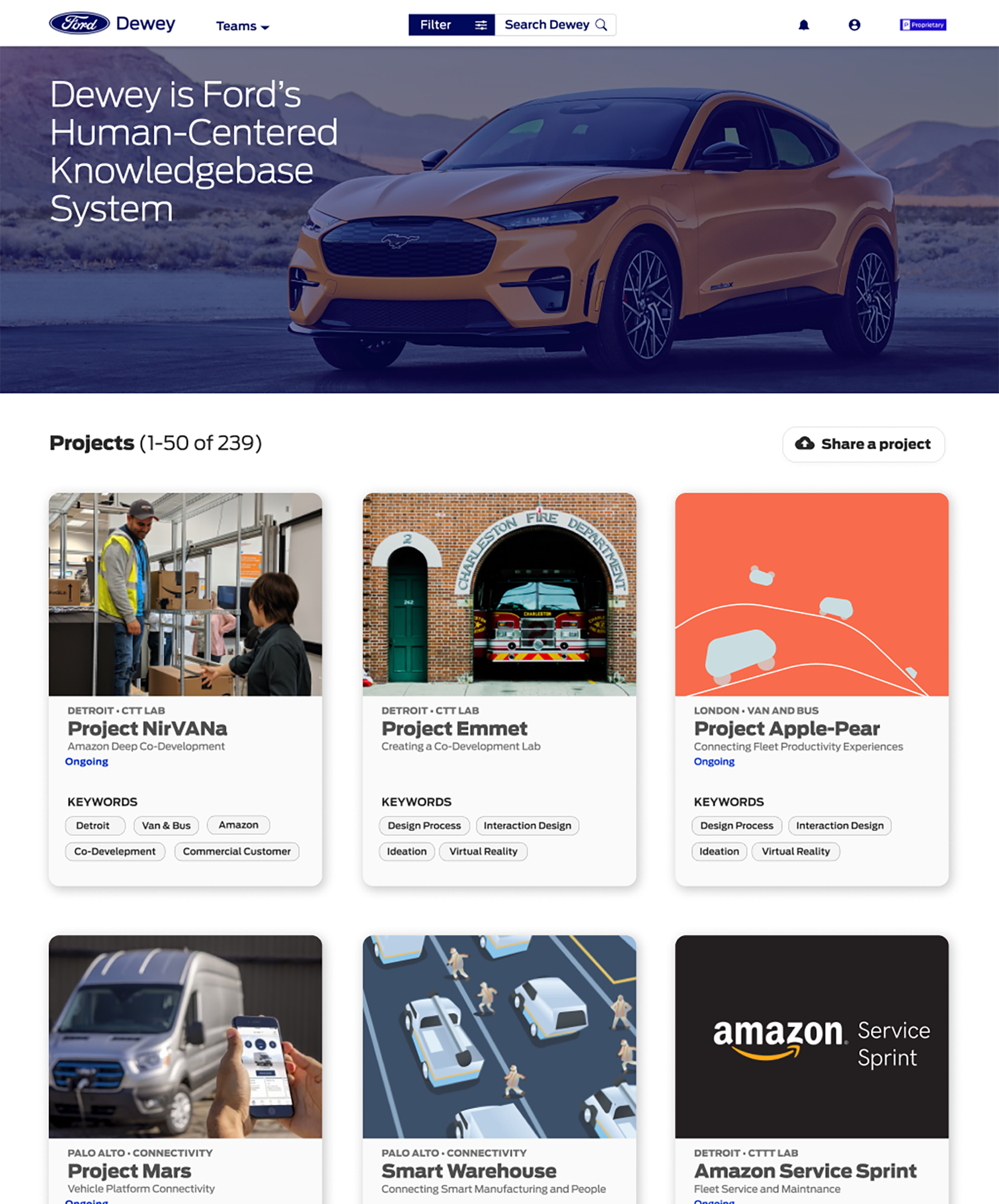
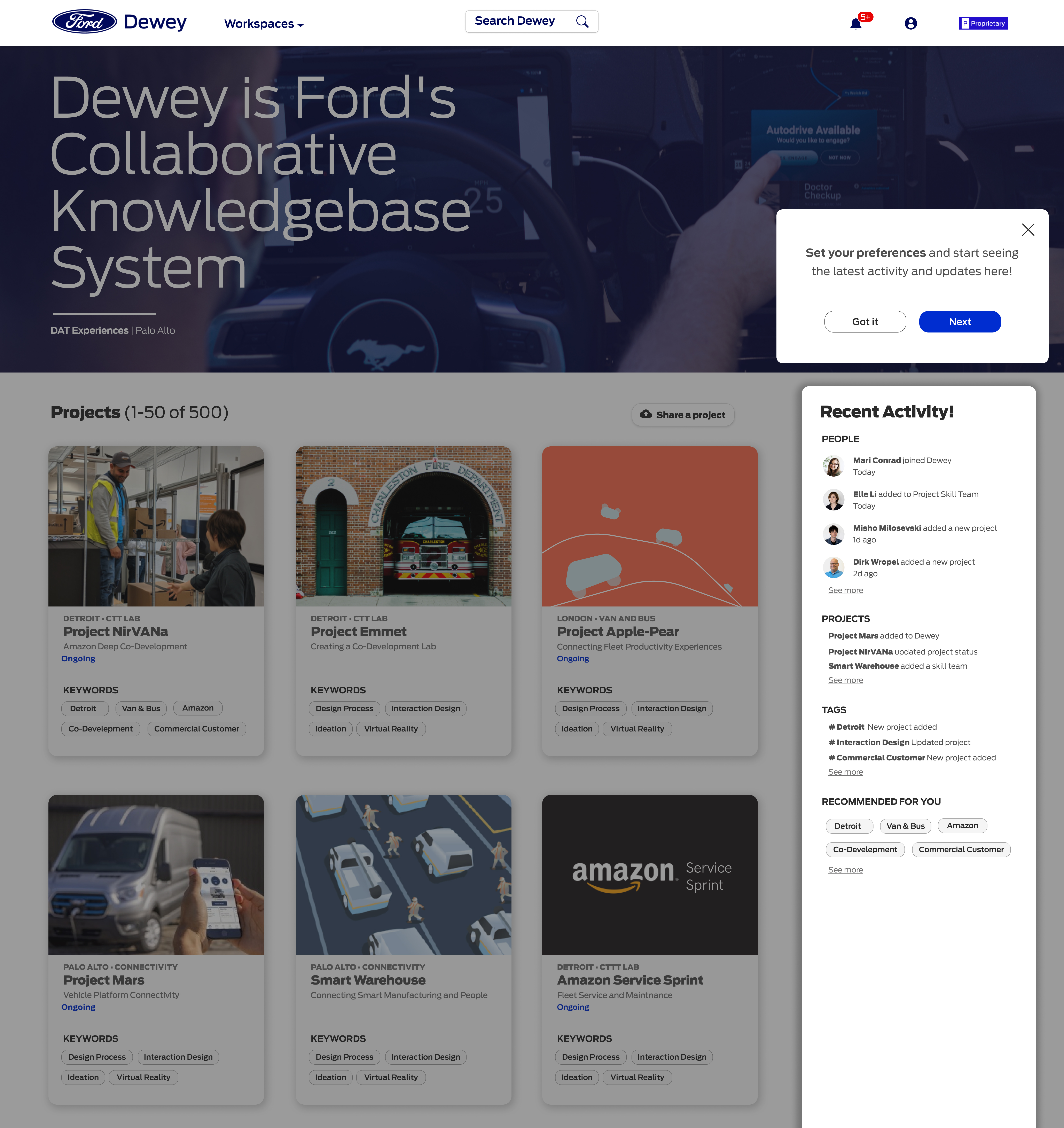
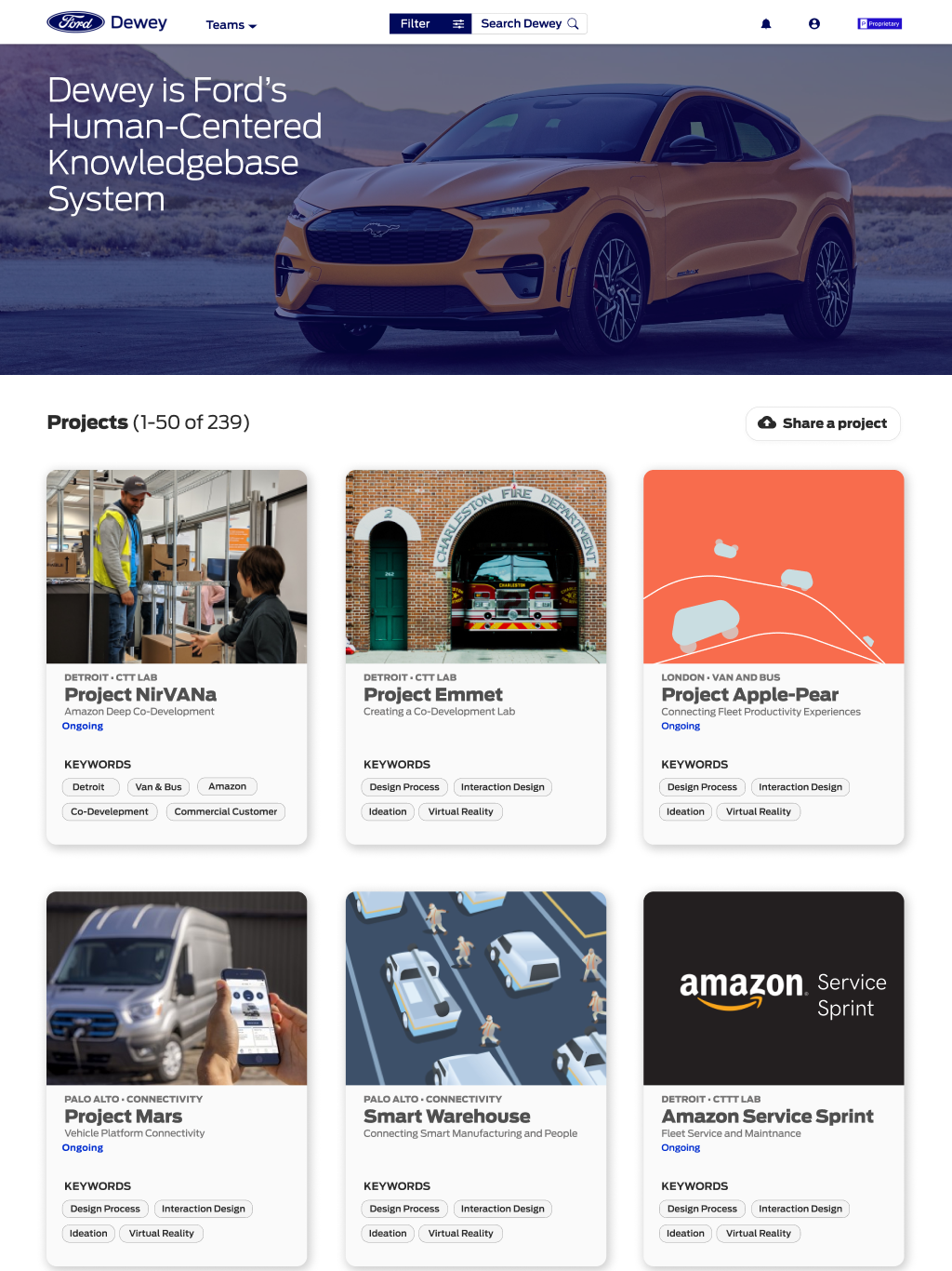
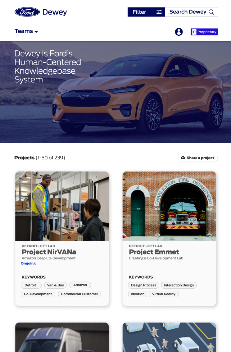
Dewey After Re-design
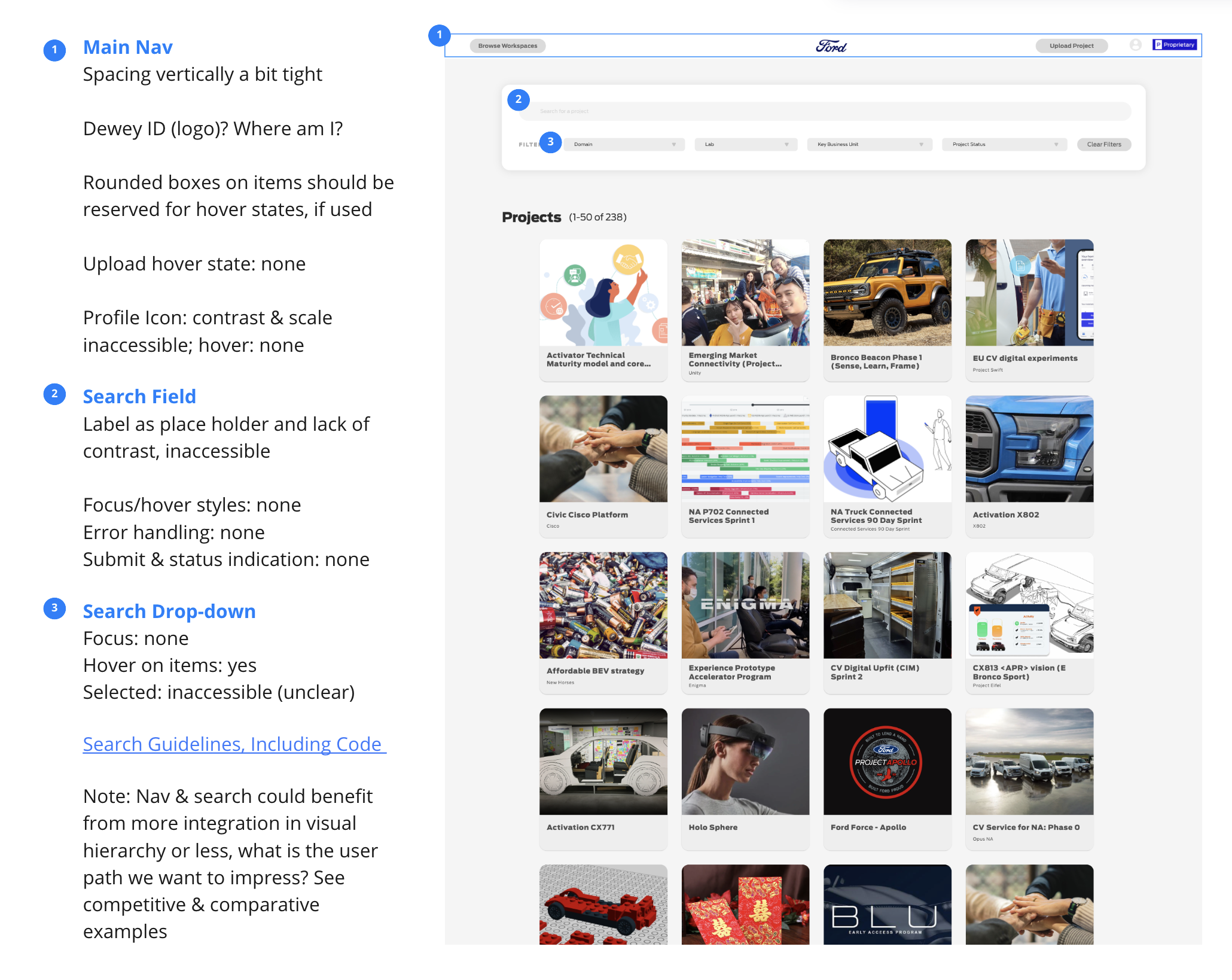
Auditing the App
When I began at Ford, I audited the product and came up with a list of re-design and opportunity priorities for new features to add to the product.
On the homepage of the app, there wasn't a sense of what the mission of the product was. The most important features, search and filter, needed to be completely redesigned. The project cards were also overwhelming and lacked balance.
Resulting UX and UI Design Priorities:
Search and Filter Redesign
Banner Image, Logo and Mission Statement
Project Card and Grid Redesign
A Design System for More Cohesive User Experience
Test New Designs and Gain Insight from Users
Search & Filter Wireframes
Early Iterations (Digital Sketches)
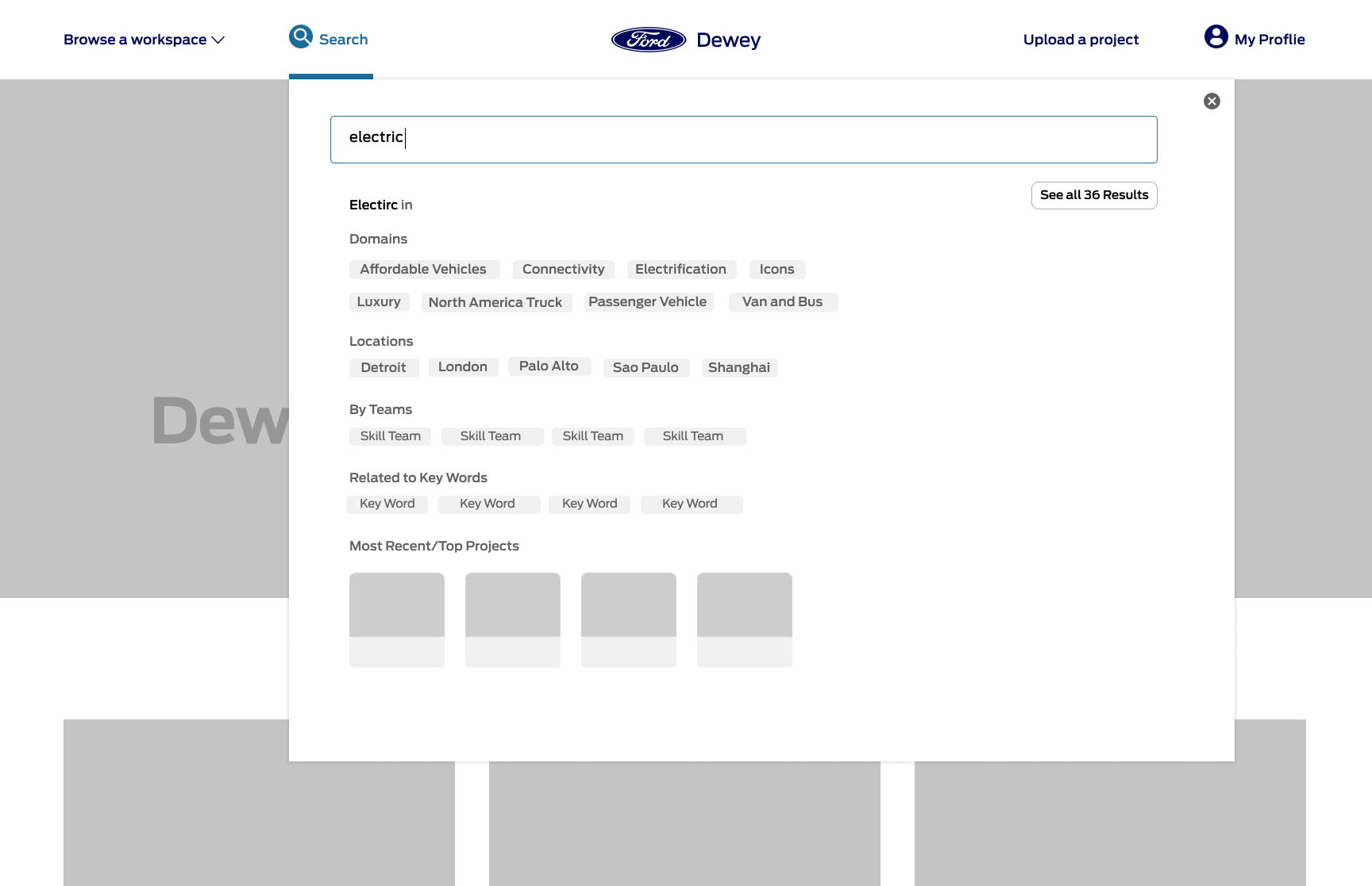
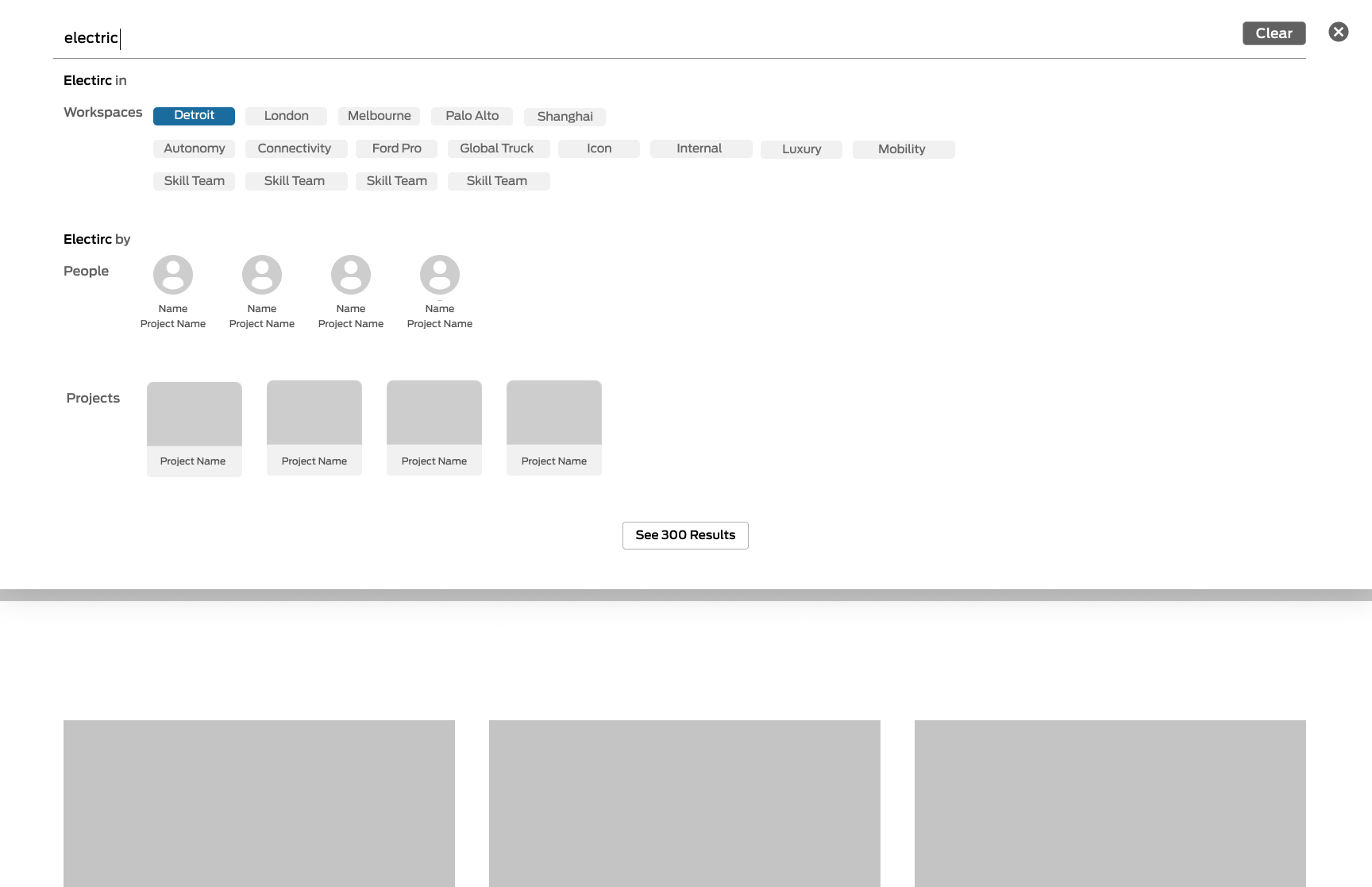
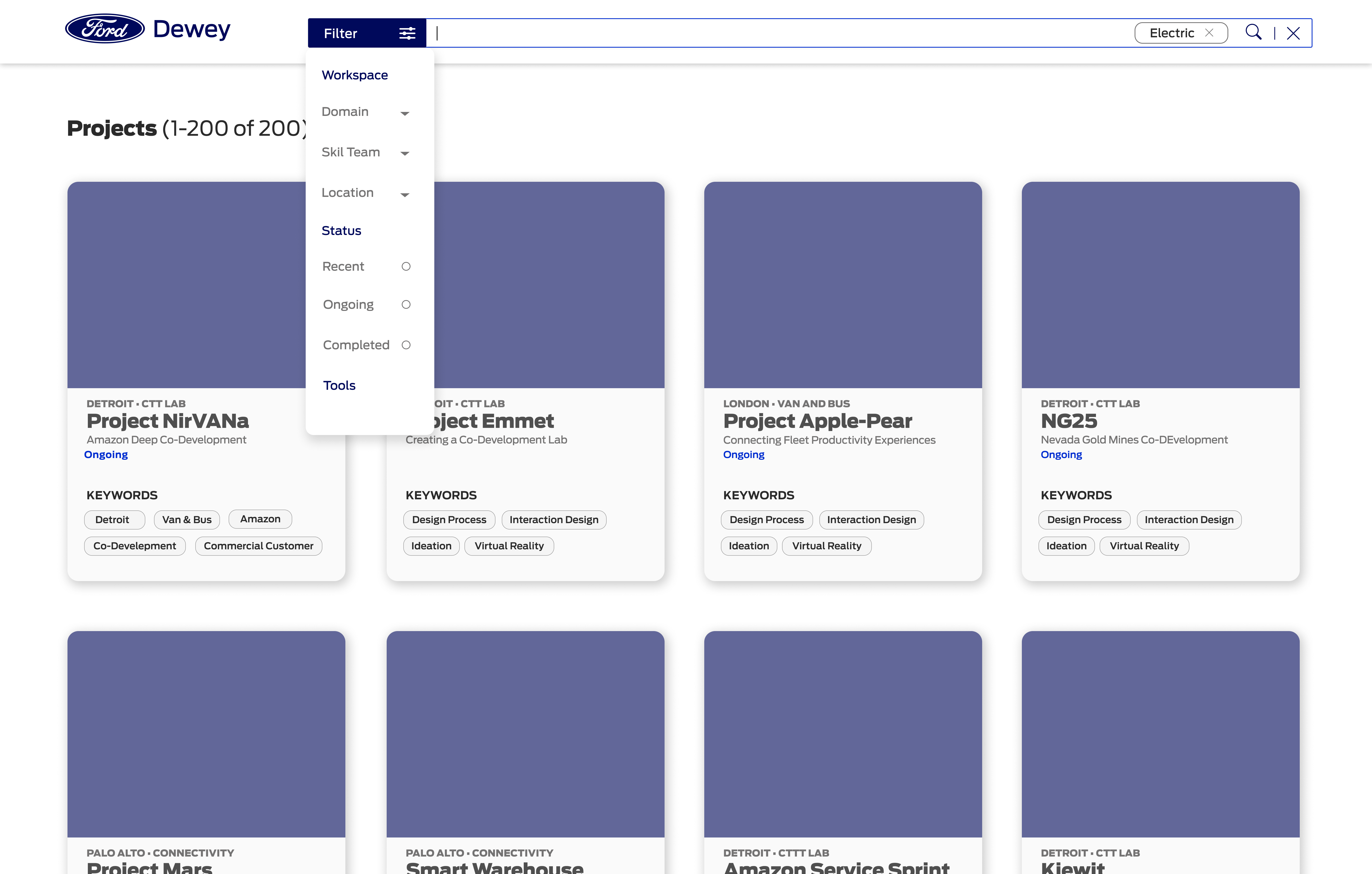
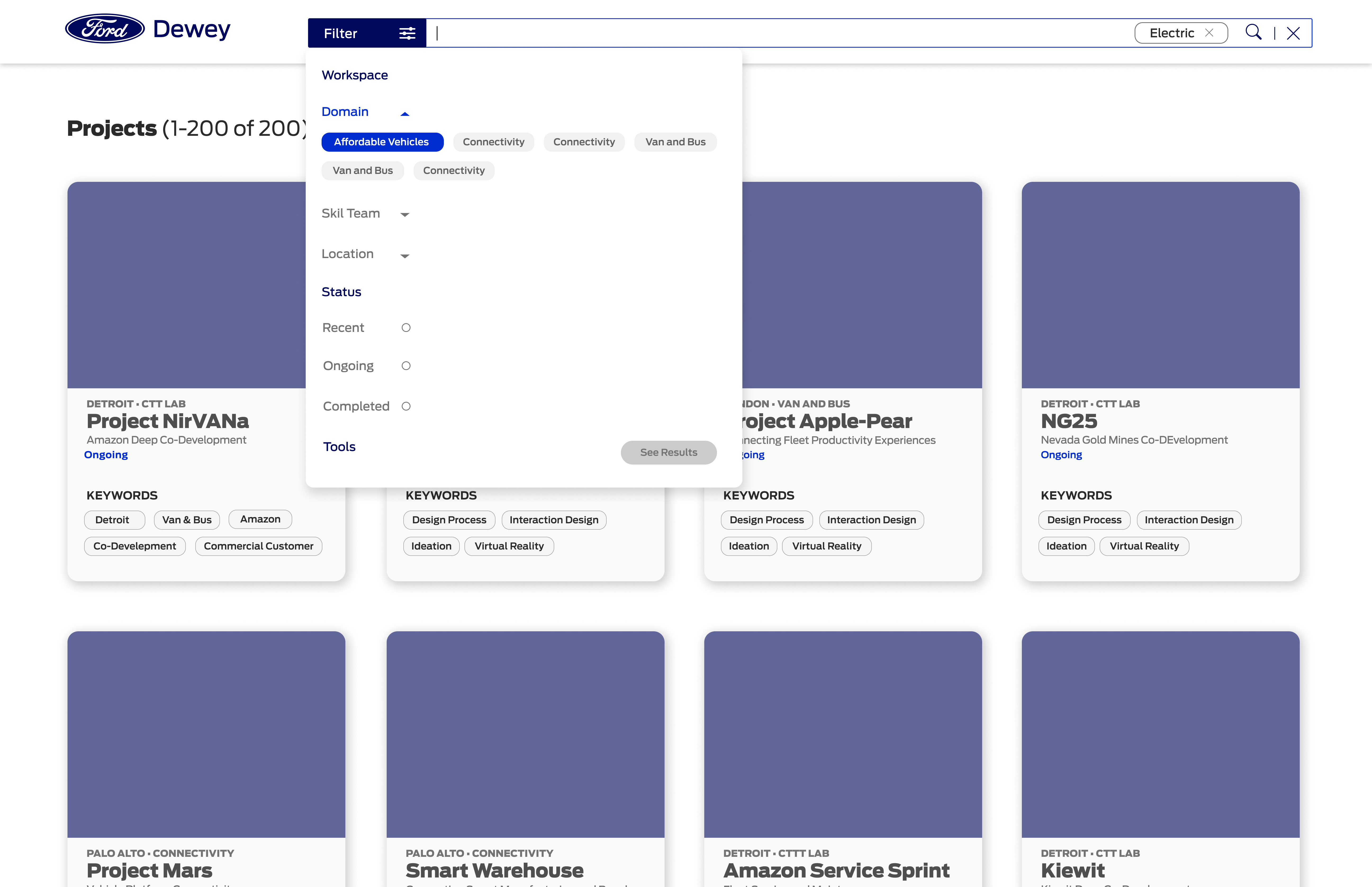
Wireframes Before Testing
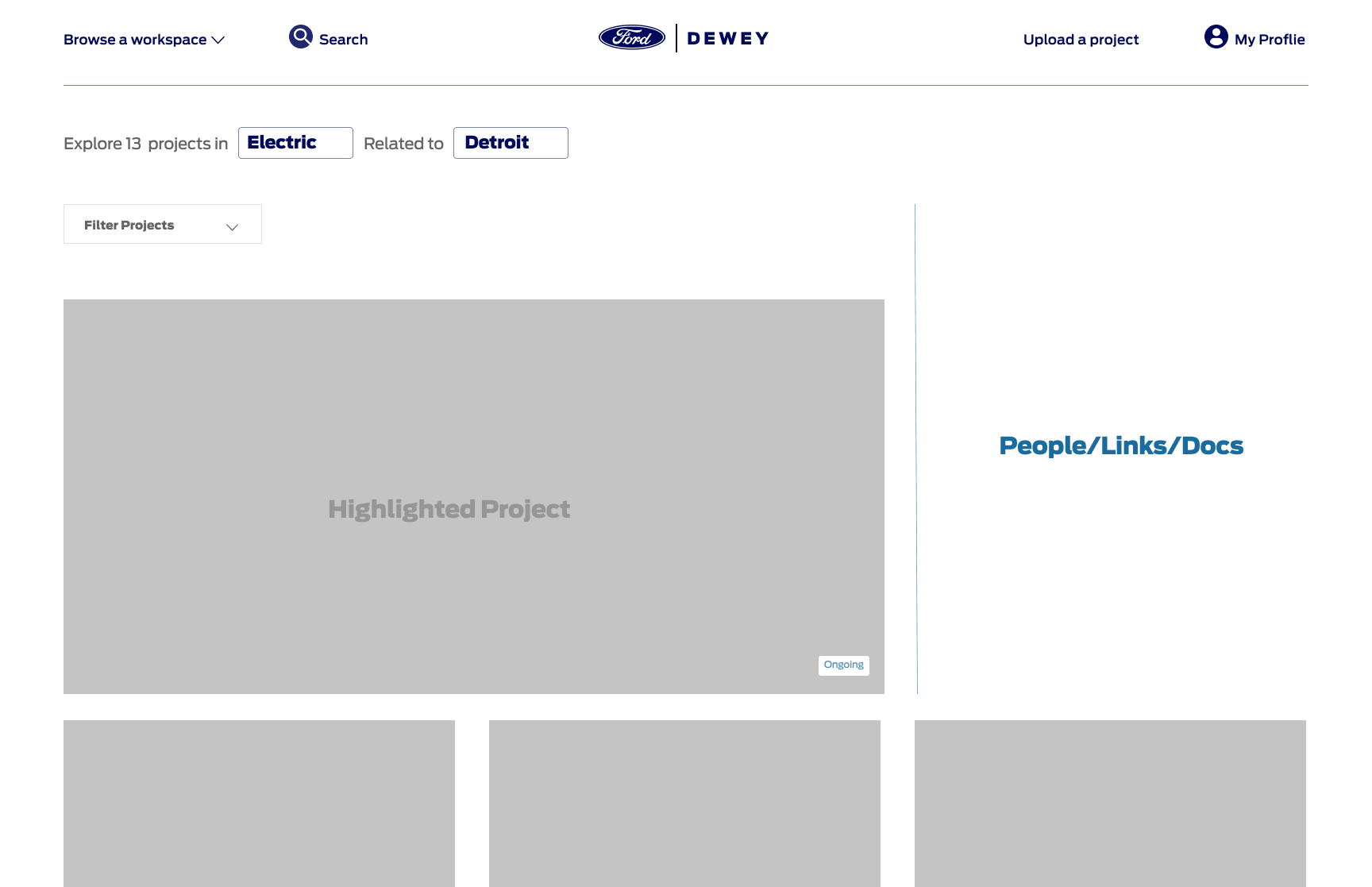
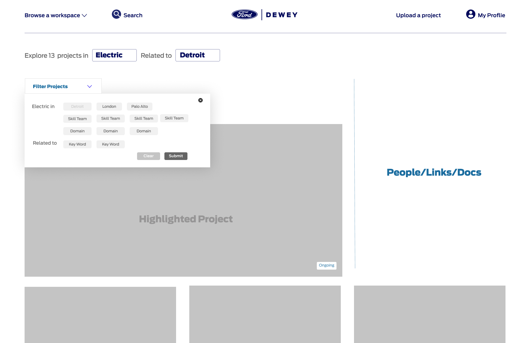
The next iteration of the wireframes, which were very close to the search and filter features used in the product after testing.
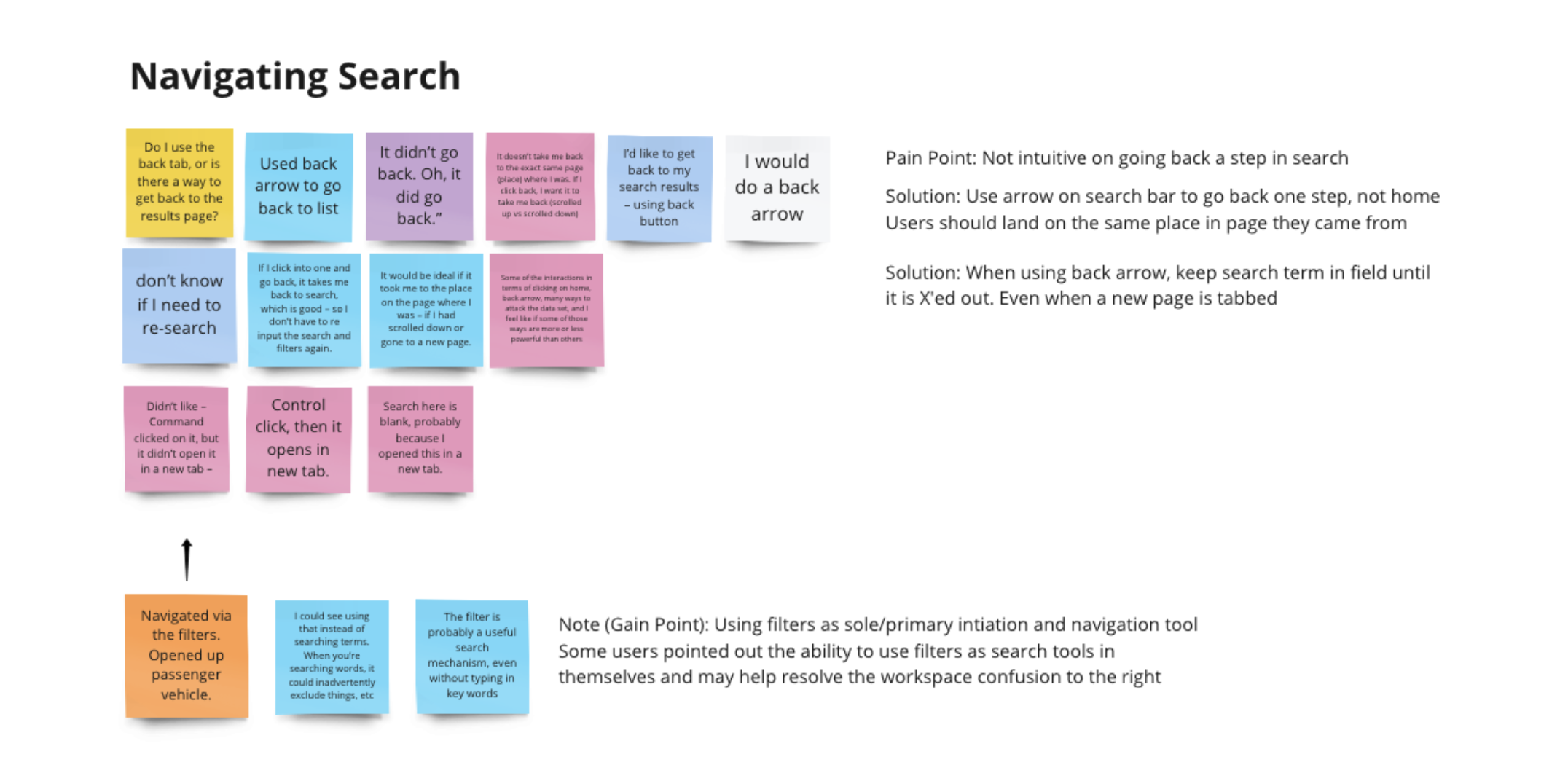
Testing
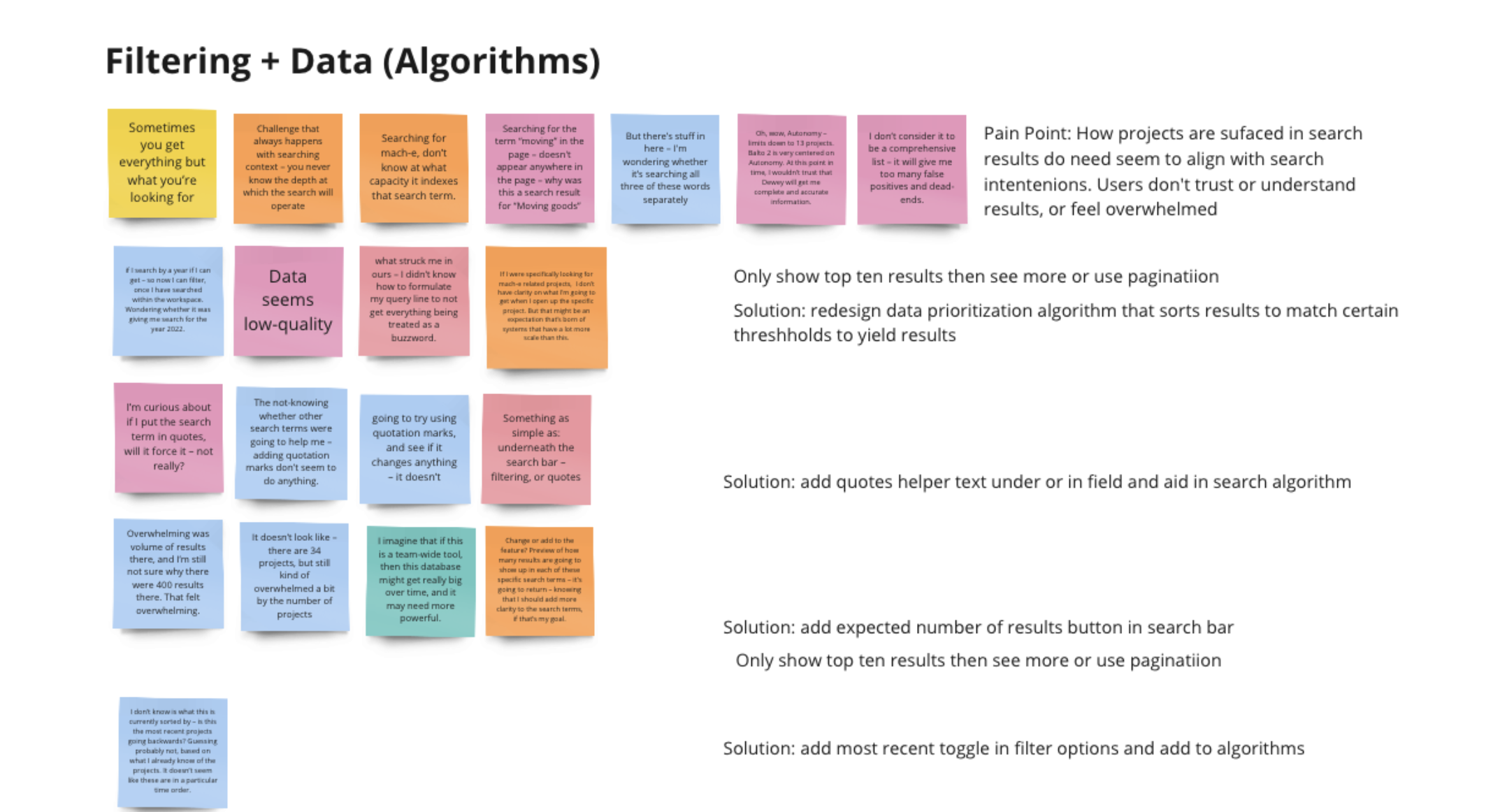
We tested the prototype live within one of our developer versions of the platform. In this way our search and filter features acted much like it would in the final product, using the same algorithms and elastic search. Our goal was to also test the results of search and filters and to find what users expected to surface and in what order.
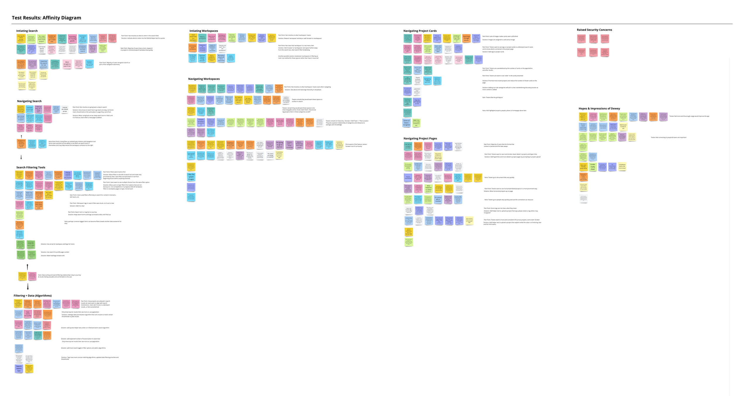
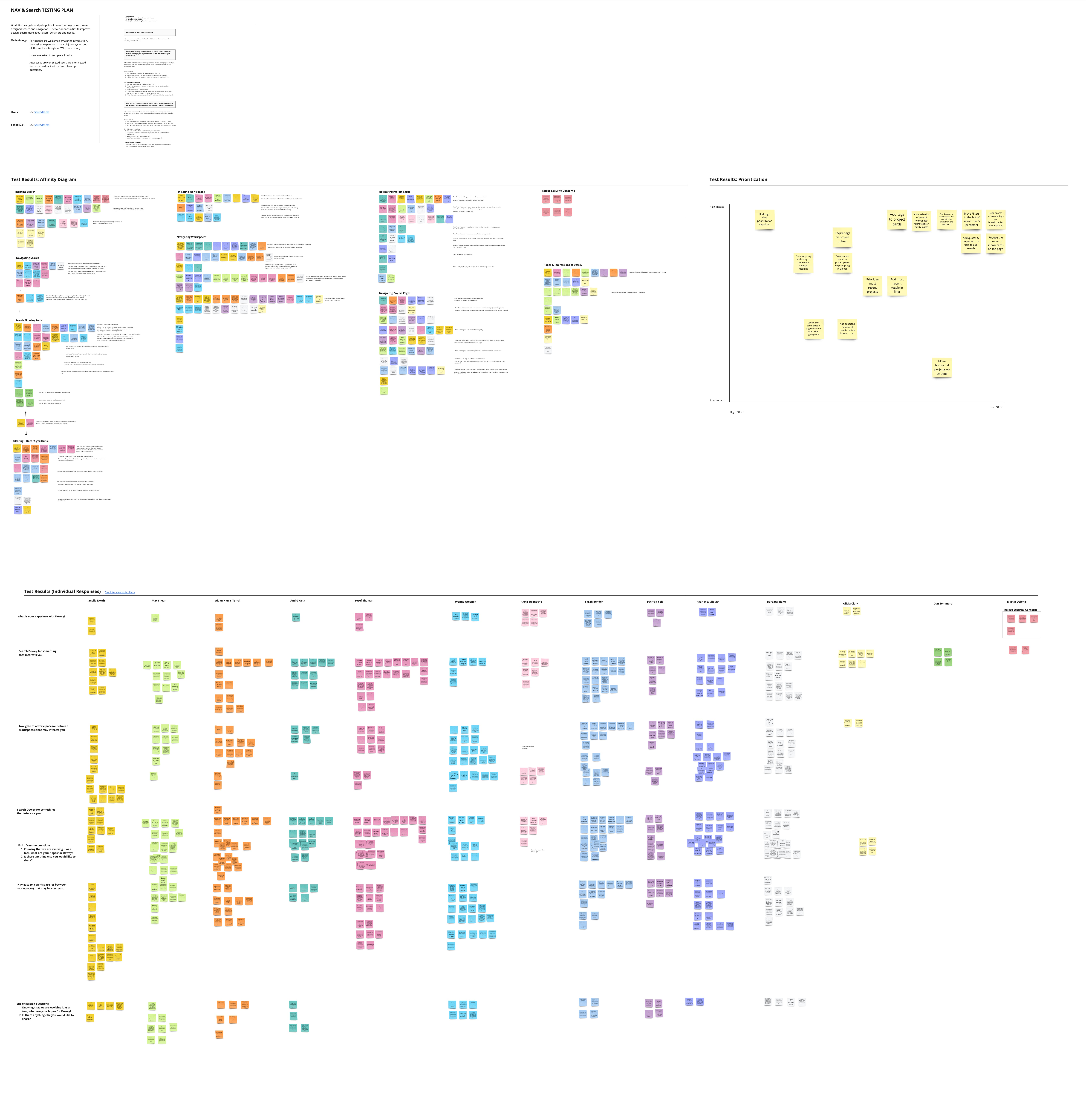
Test Results
We tested with over twenty Ford employees. We recorded, sorted and prioritized the feature changes with the results.
Our test began with a general search of google, then our app. We then also asked users what other features they would like to see from the product, and what overall it might offer in the future.
Our results asked for minimal changes to the ux/ui of the prototype. The real work needed to be done in how our algorithms surfaced results.
A few addtional features I designed, tested and implemented into the product.
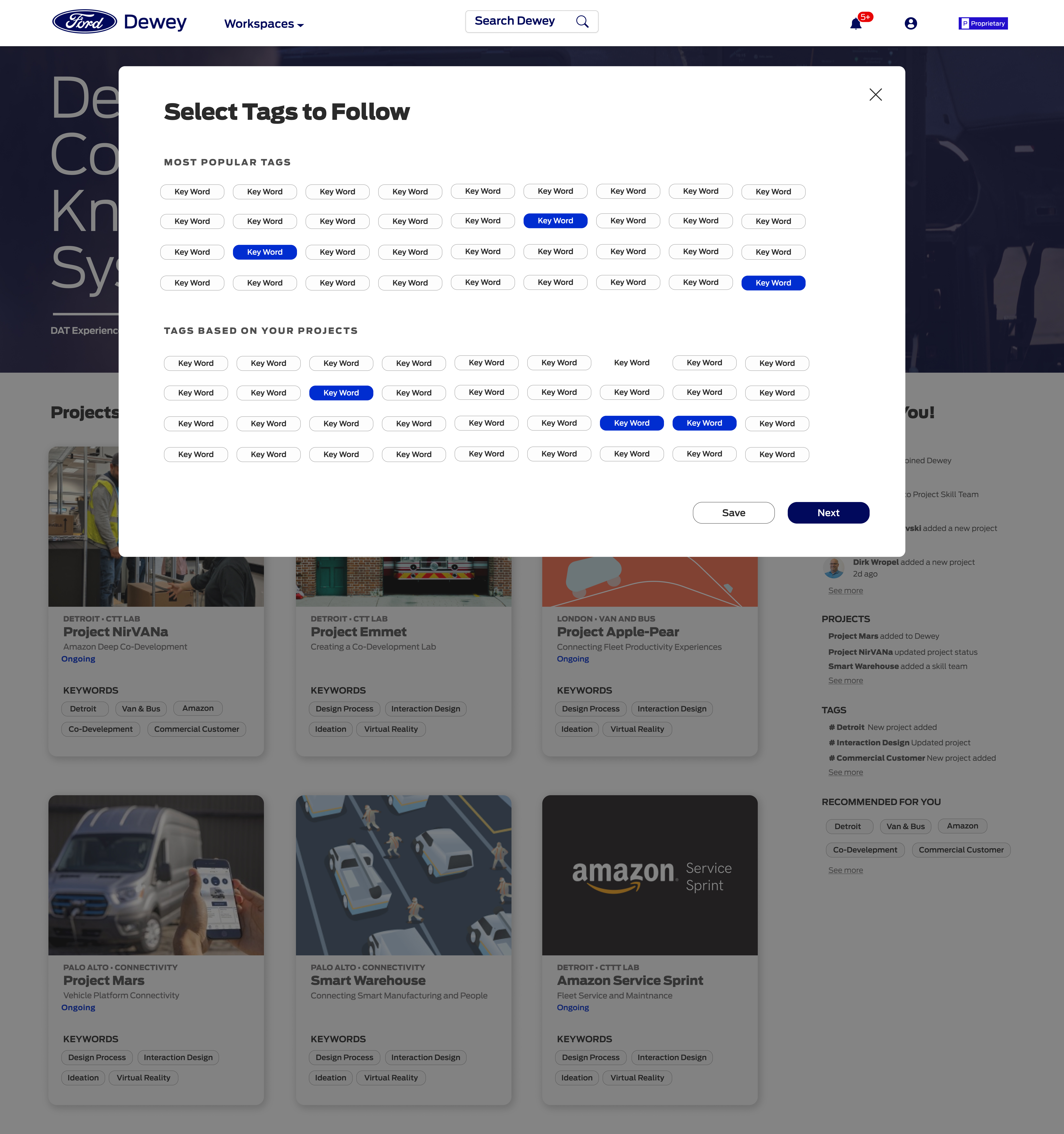
Content Customization
After I created a new search feature and worked with the devs to craft the algorithms for more accurate results. I added custom features to the skillteam pages to encourage stakeholders and teams to create more content and communicate their mission and goals along with their projects.
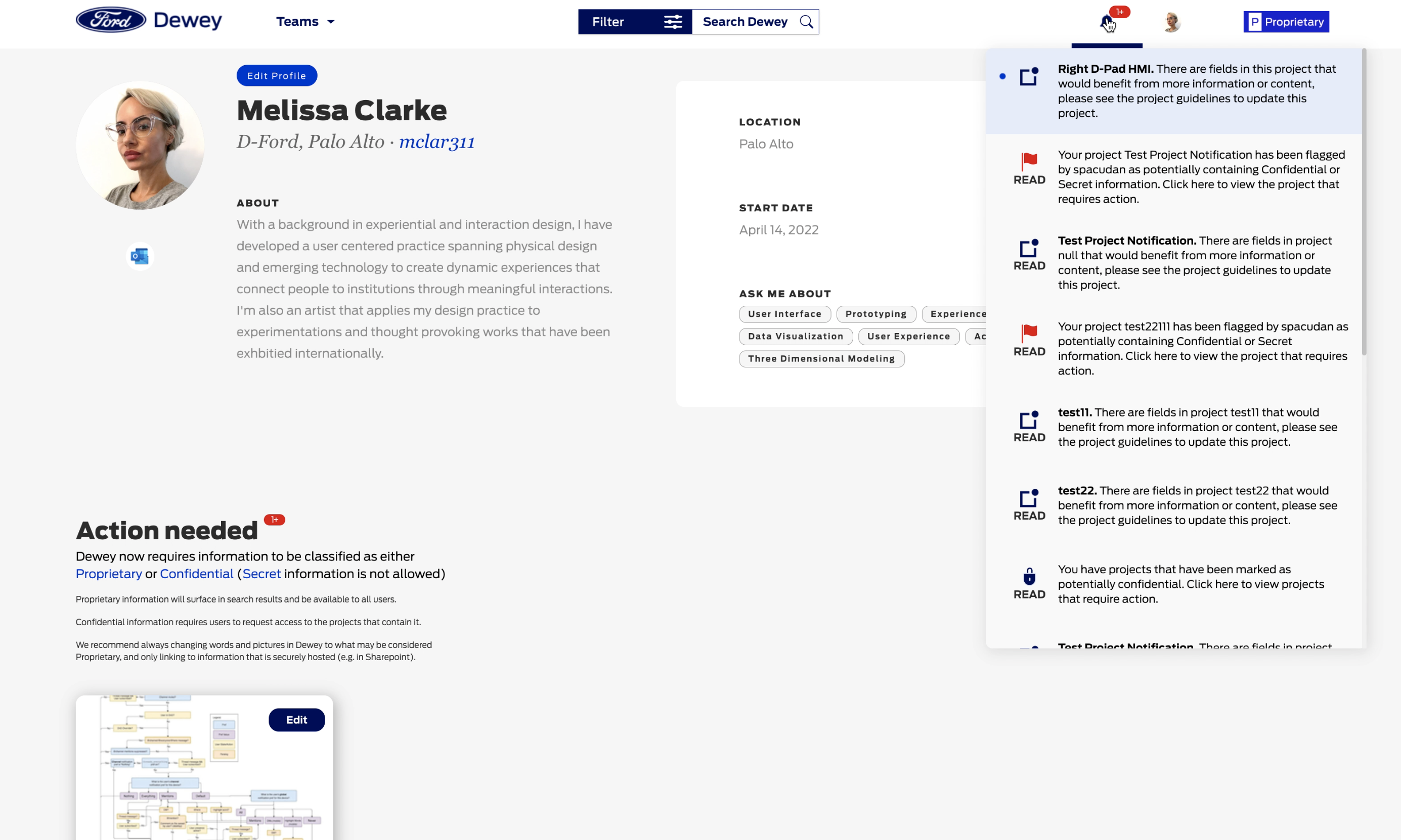
Notifications
We added notifications to help users stay on top of project updates and later to ensure that users could flag and be notified on potentially confidential or secret information in a project. We also added within that notification flow, the ability to edit information to higher level proprietary information for more visibility.
In the future we planned to add following projects and people features, as well as a newsfeed to the homepage. The notification feature was part of that plan. Users relayed following, a newsfeed and updates would create an even more robust experience.
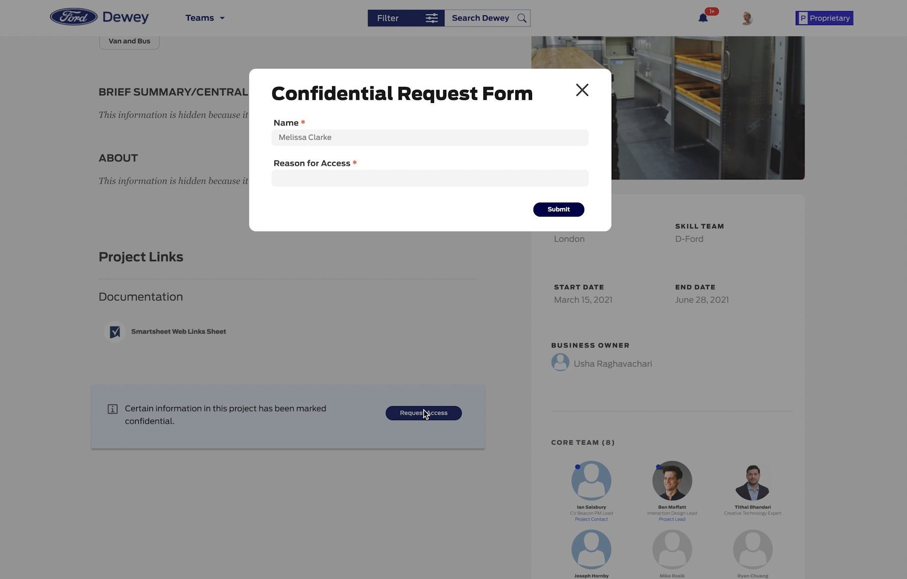
Confidential Access Request
As we added the ability to flag and mark or edit information as secret, confidential or proprietary, we also added the access request feature at the same time.
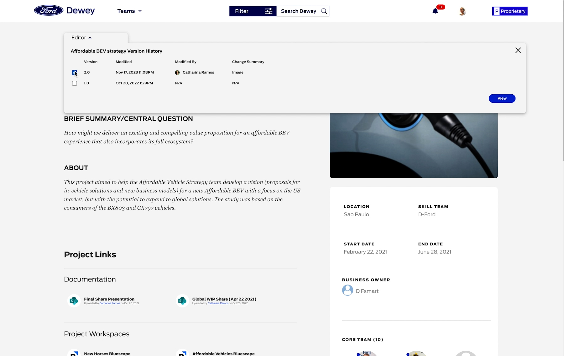
Version History & Archive
Another feature we added was a version history for users to be able to track edits and possibly revise older versions.
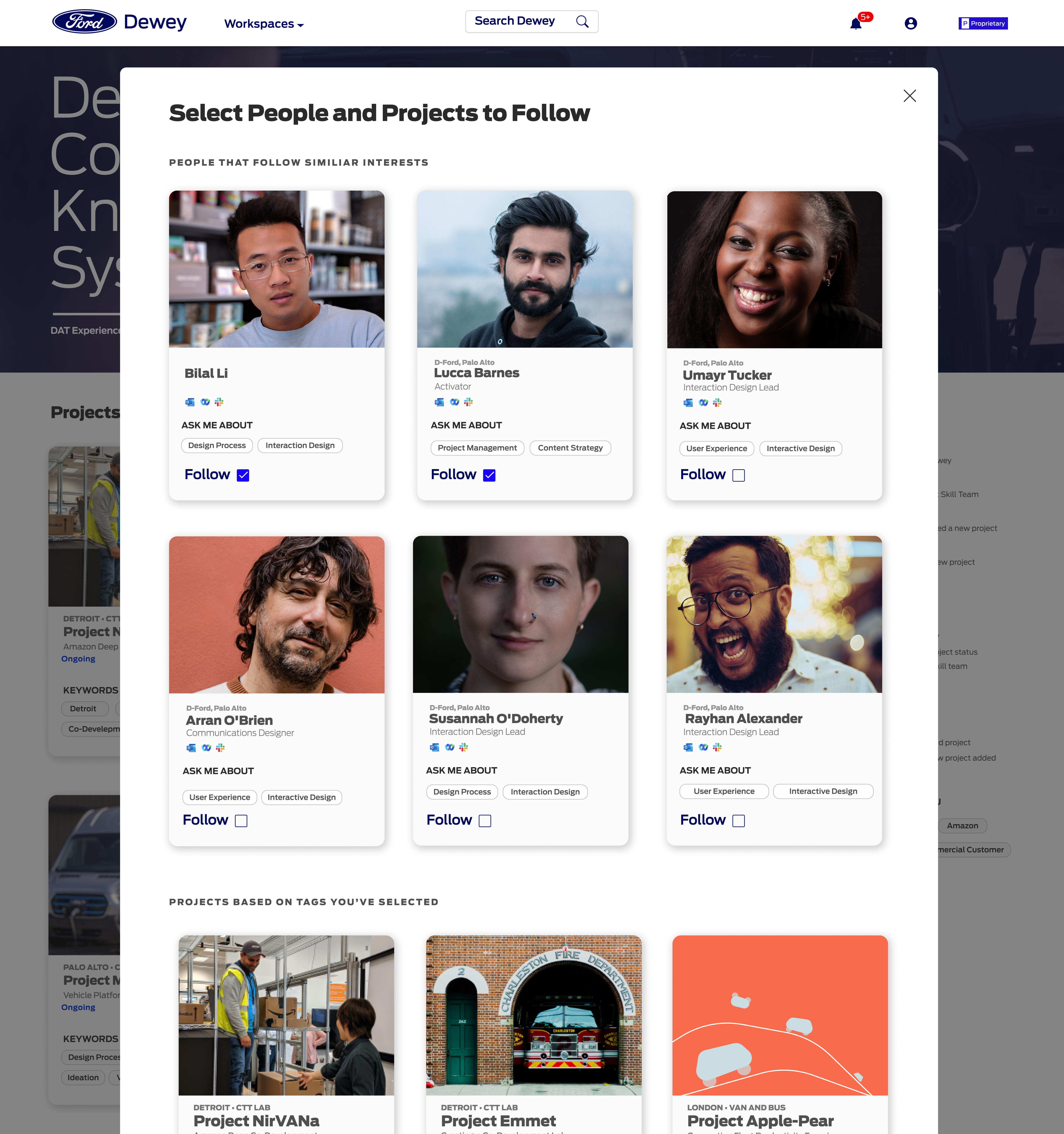
Newsfeed, Sharing & Following Features
News Feed & Following
(In progress) A few features users and myself were really excited about, that would increase retention, participation and create a more dynamic product— I designed a newsfeed and following feature. Users would be able to customize their homepage to get the latest updates and stay informed on what's going on at Ford Motors world-wide!
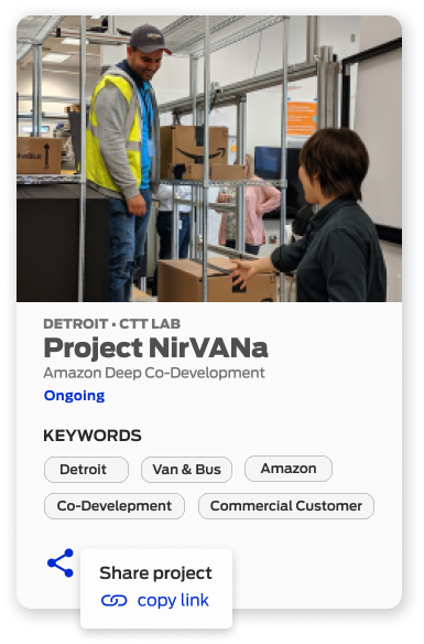
Sharing
Lastly, in progress, a feature that would allow users to share their projects across platforms. During much of our testing and feedback sessions, and in conversations with stakeholders, I discerned that sharing work from our product into slack or via other networking tools would be a great outreach tool and way for folks at Ford to easily access and amplify work knowledge.

Responsive Design & Design System
Every product should have responsive design with a design system in place. While over 90% of our users accessed Dewey by desktop, all of my designs addressed the breakpoints and grid of standard screens.
Results
We increased unique users by over 600%
Duration of average visits went from 7 to 15 minutes
Pages per visit went from 1.8 to 3.8